Book Cover
Case Studies
So many book (and other publication) covers, so little space…

Cover Concepts
If a picture is worth a thousand words, well, a cover design may well be worth many thousands of dollars*. These are the draft concept covers that I did in 2019 for a book on cryptocurrency in collaboration with Ann Sheybani. This is a good example of the amount of effort and the kinds of design ideas that I produce for my book clients—in this case the authors got seven different draft covers, each based on their general theme and style preferences, signature colors, and typography guidelines (some designs were complex composites). I work until the client is delighted.
*In terms of value to the author and publisher, not necessarily my fee.
Cover Concepts
If a picture is worth a thousand words, well, a cover design may well be worth many thousands of dollars*. I designed the cover below in 2019 for a book on cryptocurrency in collaboration with Ann Sheybani. This is a good example of the amount of effort and the kinds of design ideas that I produce for my book clients—in this case the authors got seven different draft covers, each based on their general theme and style preferences, signature colors, and typography guidelines (some designs were complex composites). I work until the client is delighted.
*In terms of value to the author and publisher, not necessarily my fee.

Book Cover Case Studies
I designed this book for an author in Vermont, a business consultant who helps “private business owners create a sustainable business that will last past them.” I designed both the cover and the interior, and it was a fun project because Josh doesn’t take himself too seriously—so we got to put a purple aardvark on the cover and the entire book is sprinkled with ants. The aardvark graphic was created by an Italian artist, and it took extensive post-processing (for example, I had to color and contour his original drawing) to get him looking adequately pathetic.
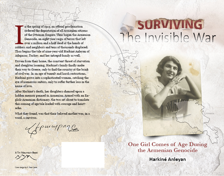
This book cover was both challenging and incredibly fulfilling. This is a complex cover, with many overlapping and blended graphic elements. The only thing I had to start with was a handful of images that the authors had managed to save. I overlaid the best shot of their mom (which needed a lot of repair) on top of a stock image of broken stone that looked like bomb debris. Then added the outlines of Armenia, Greece, and the US, with the arrows and shadows, to demonstrate the long escape route around the world. Then came the title graphic, and this is where I really scratched my head. I wanted to honor the authors with something elegant, bold, and a little bit beat up; and I wanted it to convey the idea of both invisibility and escape —the torn paper (shot in my studio) and the partially hidden and grungy text fit the bill perfectly. The last touch was to ask the authors for a hand-written example of the word survival, written in Armenian (which appears below the back cover text). I’m very proud of this cover.
This whimsical and pithy book by entrepreneur, attorney, and business consultant Mike Mackniak, was a fascinating and wonderful design project (both cover and interior). Like many projects, there were may iterations before we got the cover just right, and the biggest challenge was Mike himself—he liked everything! In fact, he loved everything! The only parameter was that he wanted the cover to be pretty minimalist; and we eventually settled on a single, simple graphic: that letter “C” icon, which I created from scratch and styled to look like a social media button (the tie to the text is that every tidbit of wisdom in Mike’s book starts with a “C.”) A subtle beam of light and smooth gradient finished the look. And Mike wanted the book to be unabashedly encouraging—a book to help people become better versions of themselves—thus the subtle message in the subtitle. A little bold goes a long way. What a wonderful project!
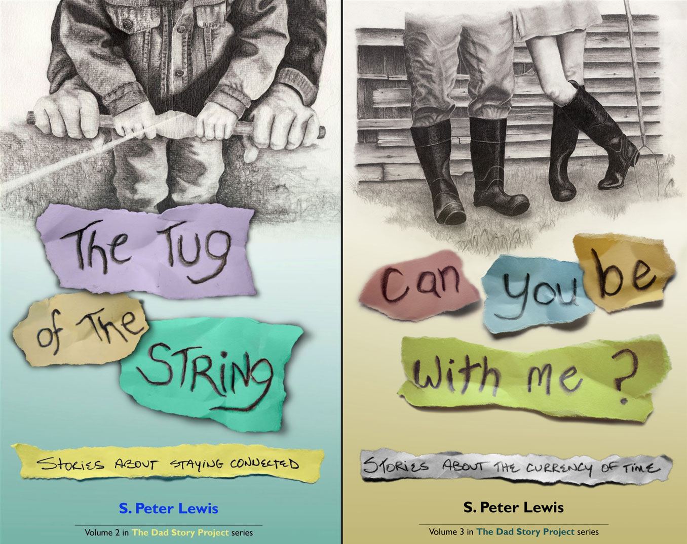
These two e-book book covers are part of a larger series of titles from my online fathering ministry, The Dad Story Project (which is currently on hold). I used pencil and charcoal drawings as the featured images, and used the consistent graphic elements of the torn colored paper for the titles and subtitles. The aim was to create simple, unique, and immediately recognizable branding for the series. The books of essays (gleaned from my award-winning newspaper column) were very well received, and can be found right here on Amazon (yes, that was shameless self promotion).
This is the cover for a massive, 350-page tome that I designed and edited for SOLO Schools, a wilderness medicne school that I have worked for since 2000. The background image is a stock shot, and I asked a coworker to build me a set of blank wooden signs set on a post. I photographed the post, and then created the text for each sign to look like it was carved into the wood and painted). I cut the headline out (in National Geographic style), and that was it. A straightforward and simple cover that looks natural (but actually took a fair bit of Photoshop wizardry). Elsewhere on this site you will see design samples from the complex interior of this book.
This is a cover waiting for an author. I liked the studio portrait so much that I decided to turn it into a cover just for fun. (Note to authors: if you’ve written this memoir, I have your draft cover ready.) I’d been thinking about this shot for some time: a low-key, minimalist, almost monochromatic portrait that evoked the idea of a life of hard work and exhaustion, but without any face in it. I used myself as the model, my favorite hat (with the Indiana Jones logo cleverly cropped out), a ratty old jacket, and my work gloves; and I shot the whole thing with just one softbox. I like the balance and near-symmetry, and the way the (fake) author’s name jumps out after your eye reaches the bottom. The typography was all designed in about a half-hour, and much refinement is necessary; but it’s a good start!
This is the second book cover I ever designed, way back in 1992, for a guidebook I co-wrote with a dear friend. The cover is very simple and straightforward: just one image and a bit of text. What isn’t so straightforward is how I got the cover image. I wanted something dramatic that showed the beauty and adventure of climbing up vertical frozen waterfalls. I had been a professional mountain guide and adventure photographer for almost a decade at this point, so it was a simple matter of rappelling down a 100-foot waterfall to shoot my friend Conrad as he climbed toward me. Couldn’t be simpler!
My bigger point here is that when it comes to cover design (and photography), there are no limits—so, no matter how crazy your idea for a cover is, don’t worry, I can do it!
Book Cover Case Studies
I designed this book for an author in Vermont, a business consultant who helps “private business owners create a sustainable business that will last past them.” I designed both the cover and the interior, and it was a fun project because Josh doesn’t take himself too seriously—so we got to put a purple aardvark on the cover and the entire book is sprinkled with ants. The aardvark graphic was created by an Italian artist, and it took extensive post-processing (for example, I had to color and contour his original drawing) to get him looking adequately pathetic.
This book cover was both challenging and incredibly fulfilling. This is a complex cover, with many overlapping and blended graphic elements. The only thing I had to start with was a handful of images that the authors had managed to save. I overlaid the best shot of their mom (which needed a lot of repair) on top of a stock image of broken stone that looked like bomb debris. Then added the outlines of Armenia, Greece, and the US, with the arrows and shadows, to demonstrate the long escape route around the world. Then came the title graphic, and this is where I really scratched my head. I wanted to honor the authors with something elegant, bold, and a little bit beat up; and I wanted it to convey the idea of both invisibility and escape —the torn paper (shot in my studio) and the partially hidden and grungy text fit the bill perfectly. The last touch was to ask the authors for a hand-written example of the word survival, written in Armenian (which appears below the back cover text). I’m very proud of this cover.
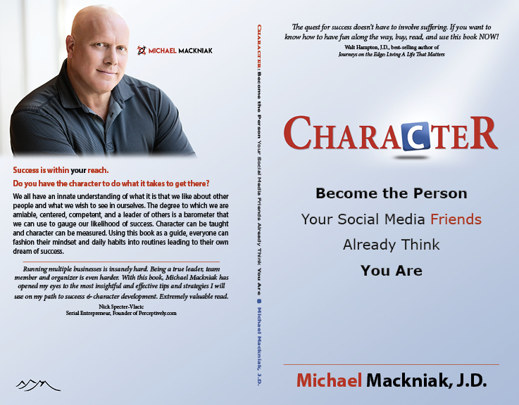
This whimsical and pithy book by entrepreneur, attorney, and business consultant Mike Mackniak, was a fascinating and wonderful design project (both cover and interior). Like many projects, there were may iterations before we got the cover just right, and the biggest challenge was Mike himself—he liked everything! In fact, he loved everything! The only parameter was that he wanted the cover to be pretty minimalist; and we eventually settled on a single, simple graphic: that letter “C” icon, which I created from scratch and styled to look like a social media button (the tie to the text is that every tidbit of wisdom in Mike’s book starts with a “C.”) A subtle beam of light and smooth gradient finished the look. And Mike wanted the book to be unabashedly encouraging—a book to help people become better versions of themselves—thus the subtle message in the subtitle. A little bold goes a long way. What a wonderful project!
These two e-book book covers are part of a larger series of titles from my online fathering ministry, The Dad Story Project (which is currently on hold). I used pencil and charcoal drawings as the featured images, and used the consistent graphic elements of the torn colored paper for the titles and subtitles. The aim was to create simple, unique, and immediately recognizable branding for the series. The books of essays (gleaned from my award-winning newspaper column) were very well received, and can be found right here on Amazon (yes, that was shameless self promotion).
This is the second book cover I ever designed, way back in 1992, for a guidebook I co-wrote with a dear friend. The cover is very simple and straightforward: just one image and a bit of text. What isn’t so straightforward is how I got the cover image. I wanted something dramatic that showed the beauty and adventure of climbing up vertical frozen waterfalls. I had been a professional mountain guide and adventure photographer for almost a decade at this point, so it was a simple matter of rappelling down a 100-foot waterfall to shoot my friend Conrad as he climbed toward me. Couldn’t be simpler!
My bigger point here is that when it comes to cover design (and photography), there are no limits—so, no matter how crazy your idea for a cover is, don’t worry, I can do it!
This is a cover waiting for an author. I liked the studio portrait so much that I decided to turn it into a cover just for fun. (Note to authors: if you’ve written this memoir, I have your draft cover ready.) I’d been thinking about this shot for some time: a low-key, minimalist, almost monochromatic portrait that evoked the idea of a life of hard work and exhaustion, but without any face in it. I used myself as the model, my favorite hat (with the Indiana Jones logo cleverly cropped out), a ratty old jacket, and my work gloves; and I shot the whole thing with just one softbox. I like the balance and near-symmetry, and the way the (fake) author’s name jumps out after your eye reaches the bottom. The typography was all designed in about a half-hour, and much refinement is necessary; but it’s a good start!
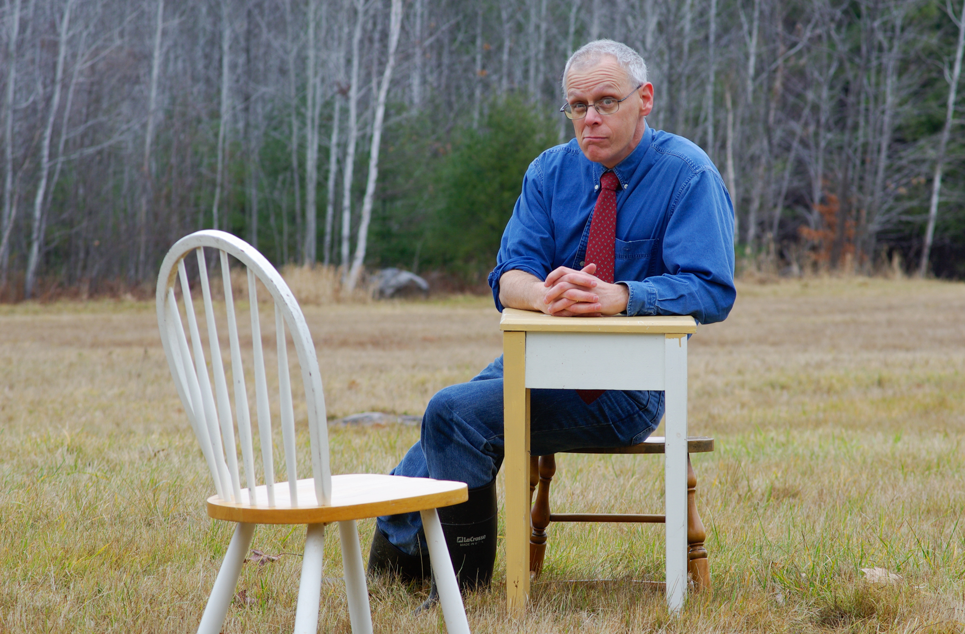
Have a seat and let's talk.
S. Peter Lewis
368 Sweden Rd. Bridgton, ME 04009
speterlewis@gmail.com | 207-239-4154

© 2020 S. Peter Lewis | All rights reserved | My hearty thanks to SOLO Schools and Tender Corporation for graciously allowing me to use some of the work I have done for them on this site.


