
Photo compositing
Compositing uses a wide variety of post-processing techniques to combine the visual elements of several sources into a single amazing image. When done well, the final result is a seamless merger that creates a new (and sometimes fantastic) whole. Compositing is widely adapted to commercial, advertising, and editorial projects. (It’s also challenging and really fun.) Here are some samples to get your creative juices flowing.

Urban First Aid Composite
The idea wit this book cover composite (the title text has been left off, for clarity), was to blend the idea of rendering first aid with an iconic symbol of an urban environment (the roadway with the double yellow lines). A very complex blend of seven layers.
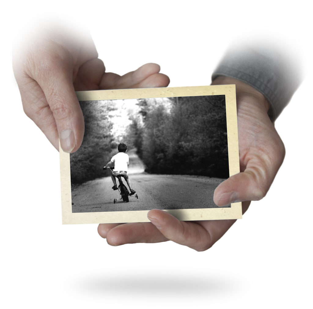
Dad Story Project Composite
Things that look simple can often be complex. This is actually a composite of five separate images. When compositing is done well, it looks seamless.
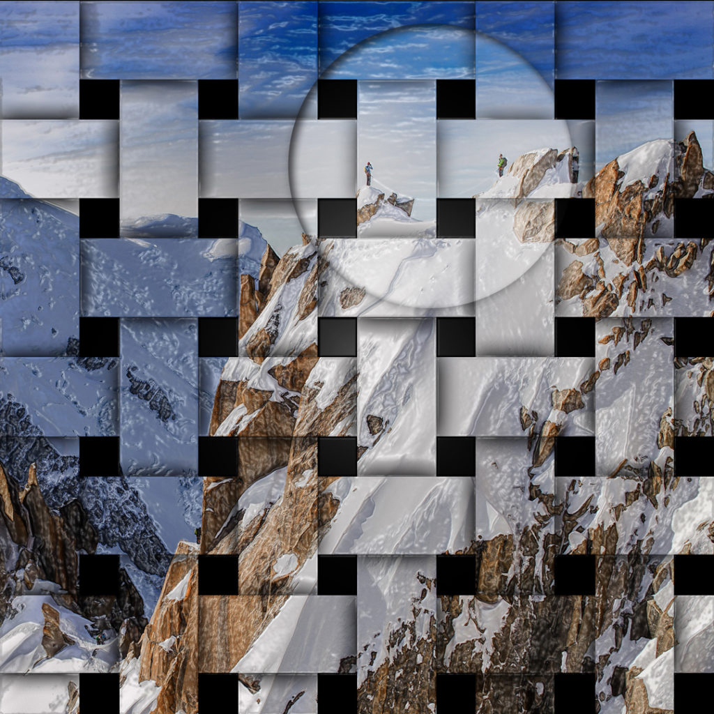
Lattice Composite
Another example of a stylized composite that should jump right off the page. These days we are constantly bombarded with imagery, and the challenge is to make people look.
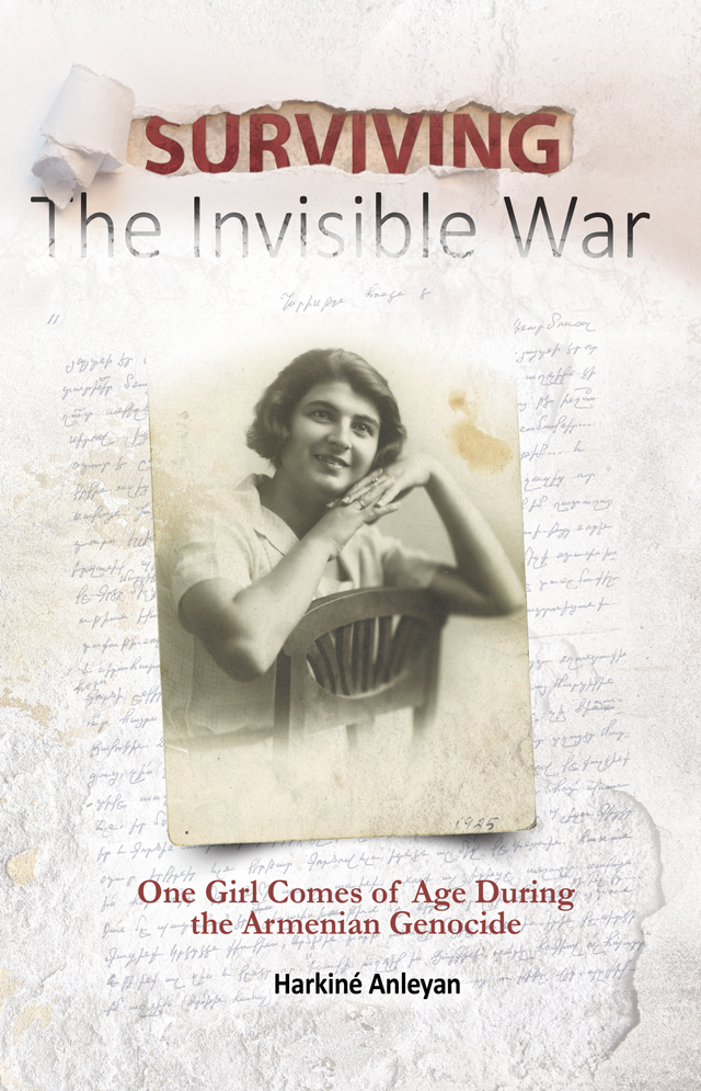
Memoir Book Cover Composite
This book cover uses no less than nine separate image and text layers, blending them into a coherent and compelling whole. I really like this one!

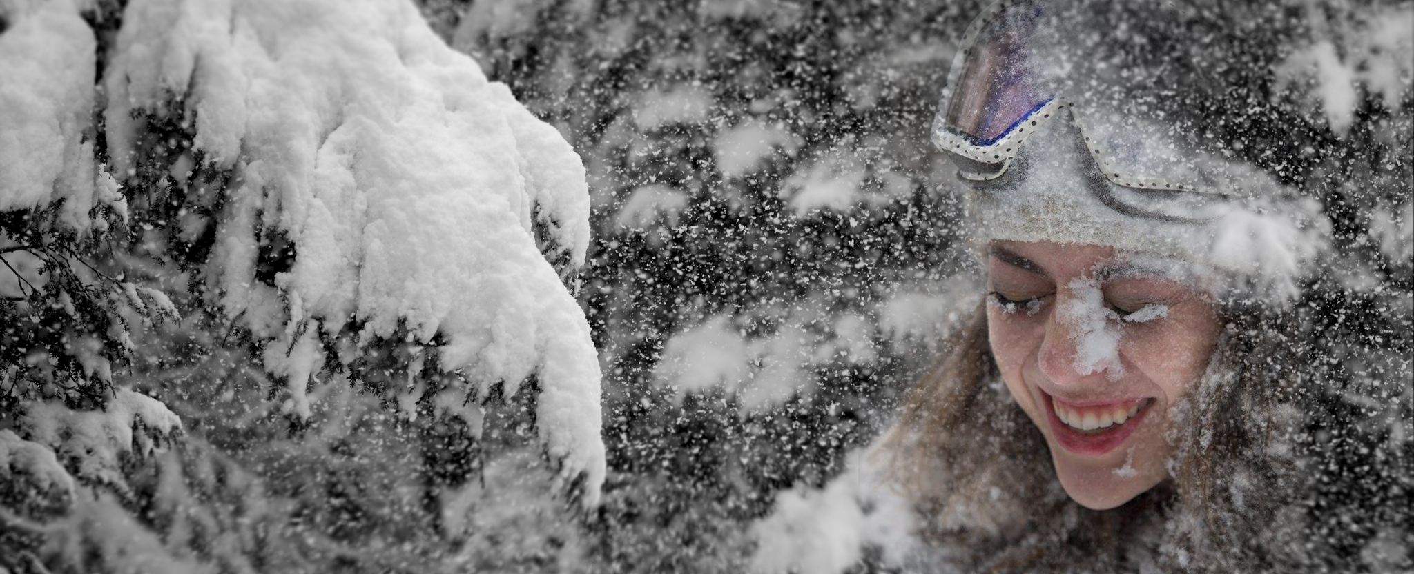
Winter Joy Composite
My daughter is a snowboarding junkie, and this is a tribute to her enthusiasm and joy. It took about a dozen images of the snow scene to get enough flakes, which drives home the idea that when compositing is done well, it looks really easy.
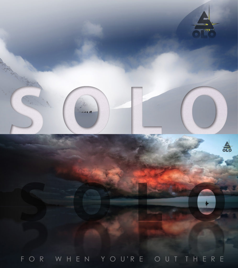
Infographics Composite
Two examples of simple composites I made as online infographics for the company I work for. They are meant to look a bit brooding and scary, to encourage people to get first aid training.
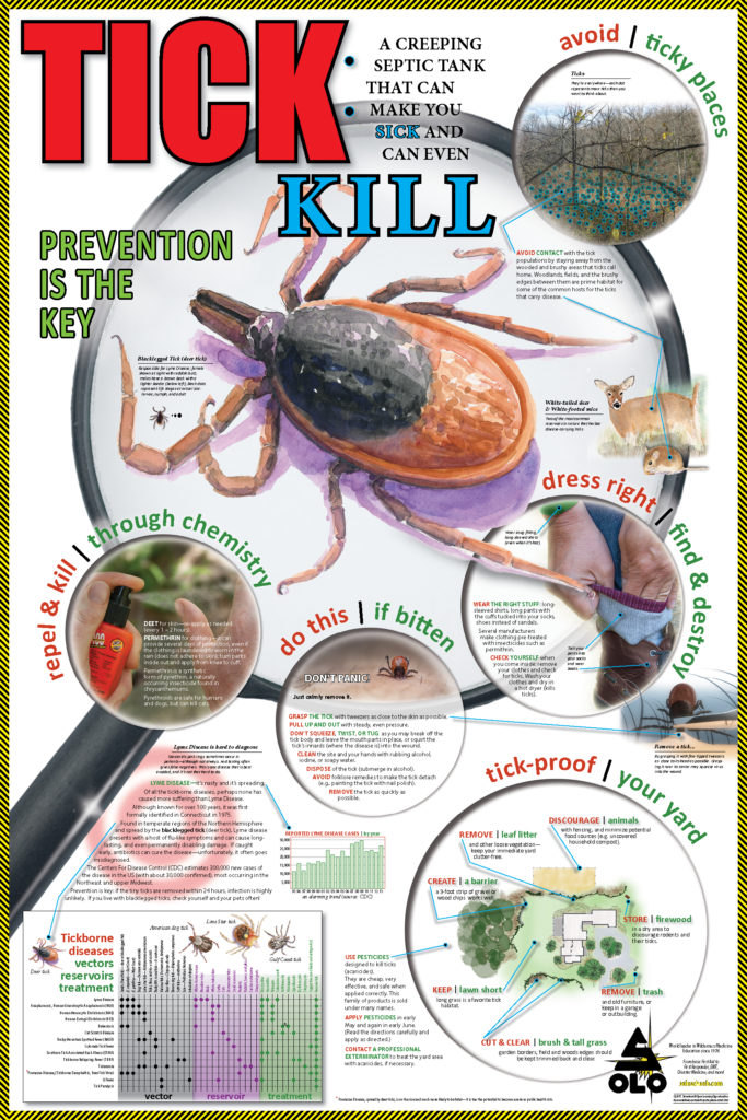
Tick Poster Composite
This is a very complex composite of text, photo, watercolor, and graphics layers for a 24″ x 36″ inch public service poster we did. The number of individual elements is astounding, but it came together well.
Trench Foot Composite
A very simple, two-image, stylized composite to illustrate the concept of the kind of damage that trench foot can do (the takeaway is don’t ever let this happen to you).

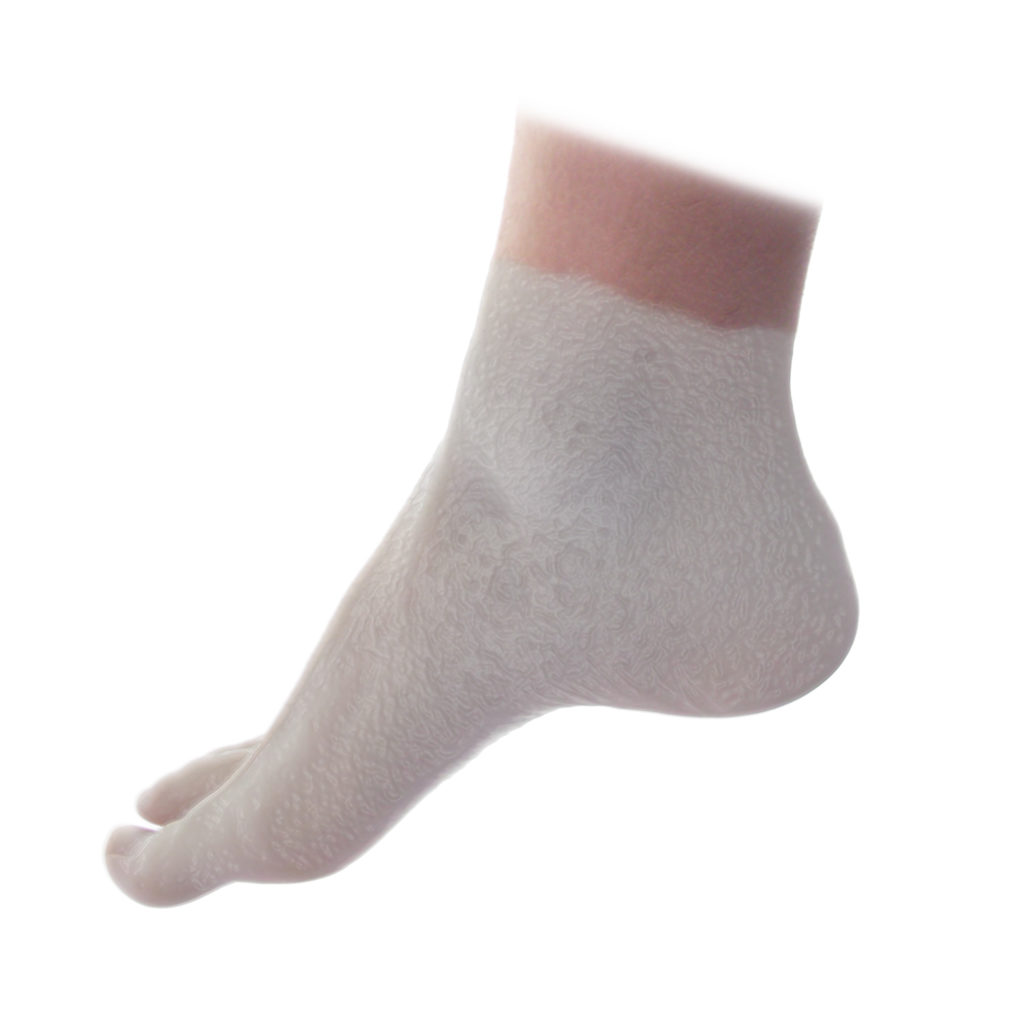
Ouch Composite
We just wanted to get people’s attention with this simple composite. I used my own foot and then superimposed the nail. And yes, I know I have weird toes (it’s hard to find good foot models).

Conference Flyer Composite
About a dozen layers were blended together to create this cover for a medical conference.
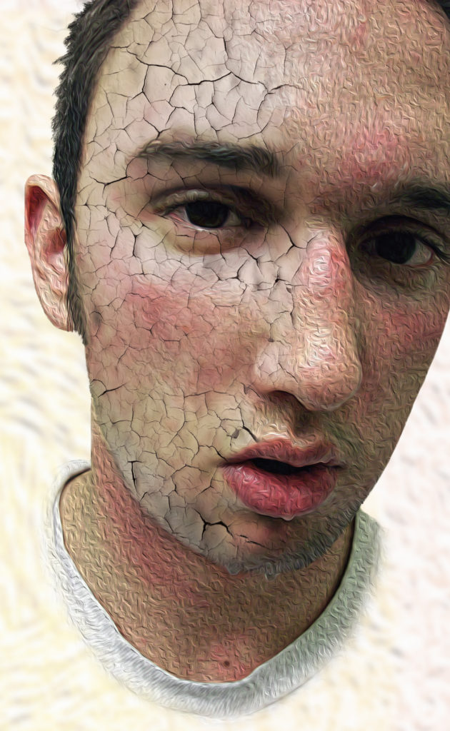
Cracked Face Composite
The idea here was to create a striking, and somewhat bizarre stylized caricature of someone who was hot and dehydrated to an extreme degree. For shock value.
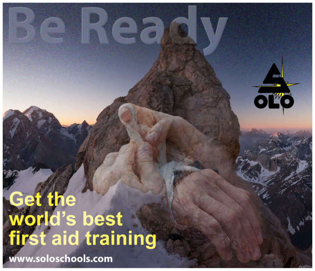
Be Ready Composite
A simple, yet compelling, composite infographic for the medical school I work for. With noise and other effects added to increase the gritty factor.
Urban First Aid Composite
The idea wit this book cover composite (the title text has been left off, for clarity), was to blend the idea of rendering first aid with an iconic symbol of an urban environment (the roadway with the double yellow lines). A very complex blend of seven layers.
Dad Story Project Composite
Things that look simple can often be complex. This is actually a composite of five separate images. When compositing is done well, it looks seamless.
Lattice Composite
Another example of a stylized composite that should jump right off the page. These days we are constantly bombarded with imagery, and the challenge is to make people look.
Memoir Book Cover Composite
This book cover uses no less than nine separate image and text layers, blending them into a coherent and compelling whole. I really like this one!
Winter Joy Composite
My daughter is a snowboarding junkie, and this is a tribute to her enthusiasm and joy. It took about a dozen images of the snow scene to get enough flakes, which drives home the idea that when compositing is done well, it looks really easy.
Infographics Composite
Two examples of simple composites I made as online infographics for the company I work for. They are meant to look a bit brooding and scary, to encourage people to get first aid training.
Tick Poster Composite
This is a very complex composite of text, photo, watercolor, and graphics layers for a 24″ x 36″ inch public service poster we did. The number of individual elements is astounding, but it came together well.
Trench Foot Composite
A very simple, two-image, stylized composite to illustrate the concept of the kind of damage that trench foot can do (the takeaway is don’t ever let this happen to you).
Ouch Composite
We just wanted to get people’s attention with this simple composite. I used my own foot and then superimposed the nail. And yes, I know I have weird toes (it’s hard to find good foot models).
Conference Flyer Composite
About a dozen layers were blended together to create this cover for a medical conference.
Cracked Face Composite
The idea here was to create a striking, and somewhat bizarre stylized caricature of someone who was hot and dehydrated to an extreme degree. For shock value.
Be Ready Composite
A simple, yet compelling, composite infographic for the medical school I work for. With noise and other effects added to increase the gritty factor.
Have a seat and let's talk.
S. Peter Lewis
368 Sweden Rd. Bridgton, ME 04009
speterlewis@gmail.com | 207-239-4154
© 2020 S. Peter Lewis | All rights reserved | My hearty thanks to SOLO Schools and Tender Corporation for graciously allowing me to use some of the work I have done for them on this site.