Image Post Processing
The atonishing magic of Photoshop
In 35 years of doing this professionally, I’ve never seen a perfect image come out of a camera—every image can be made better through post processing. In today’s digital workflow, it’s imperative that we take advantage of technology to make every image the best it can be. Here are some examples of post processing, some basic to advanced. And the best processing is essentially invisible—for even more radical transformations, check out the Composting Page.
Color replacement
We wanted to use this stock photo (not mine) in a public service announcement (PSA) on avalanche safety, and while we liked the striking composition, the coloring was just sort of blah, so I gave it a little pop. One of the tricks to editing shots like this is to maintain the contours and shadows of the subject, while completely altering its color. It takes a steady hand (and great algorithms).
Skin and eye corrections
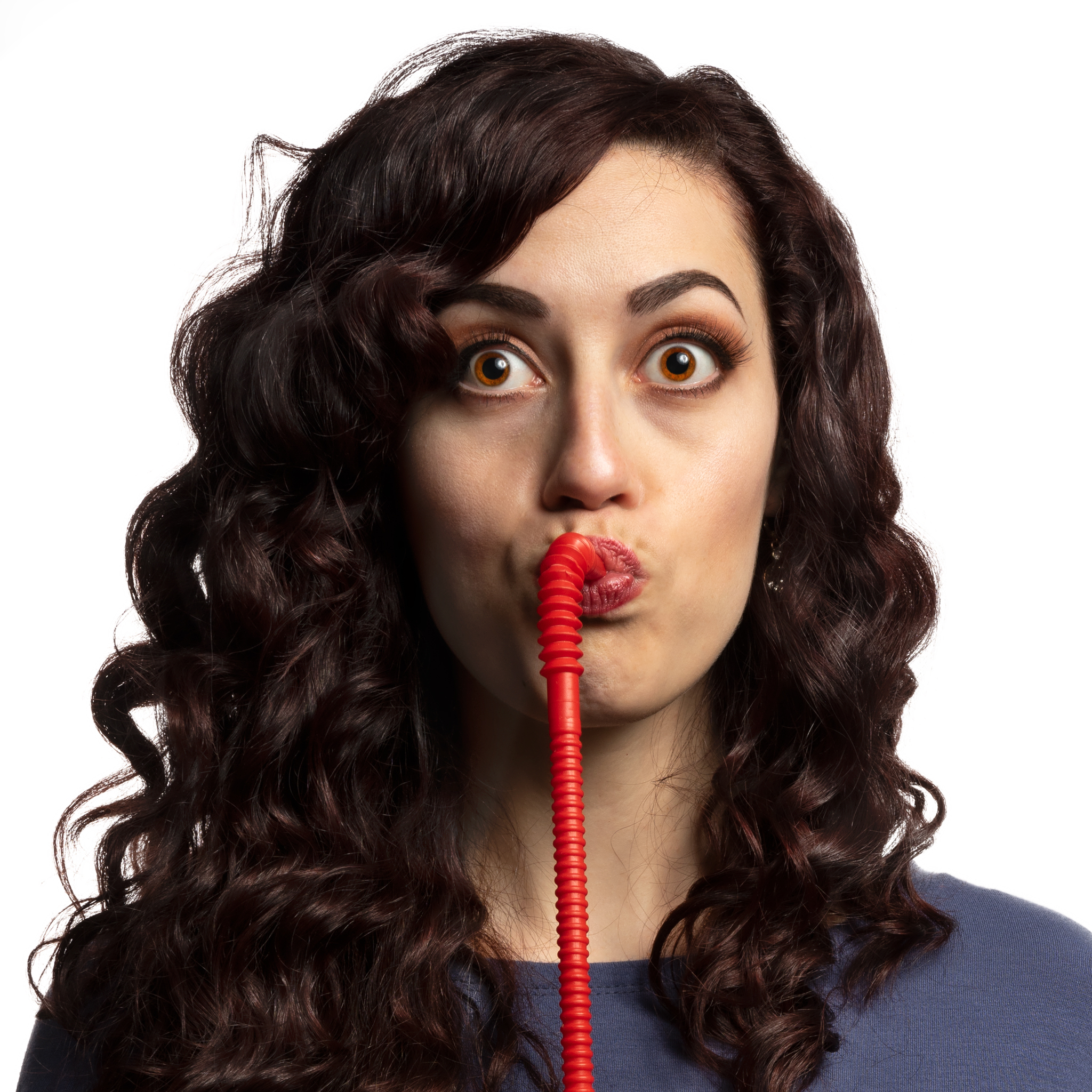
One of the most common photo-editing tasks is cleaning up skin and making eyes pop. This photo of a beautiful young woman (my daughter) shows that she has an almost perfect complexion. But alas, even my own progeny can benefit from some Photoshop wizardry. And her eyes, oh those eyes…all I did was bring out what was already there. When done right, skin, eye, and other portrait enhancements look so natural and subtle that you can’t see the hand of the touch-up artist. When overdone, they can look so perfect there just ain’t no way their real human beings (but we buy the product anyway).
Changing subjects
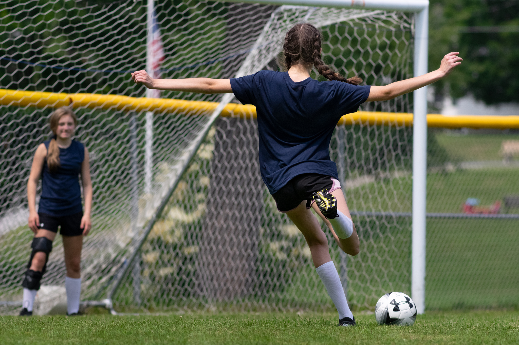
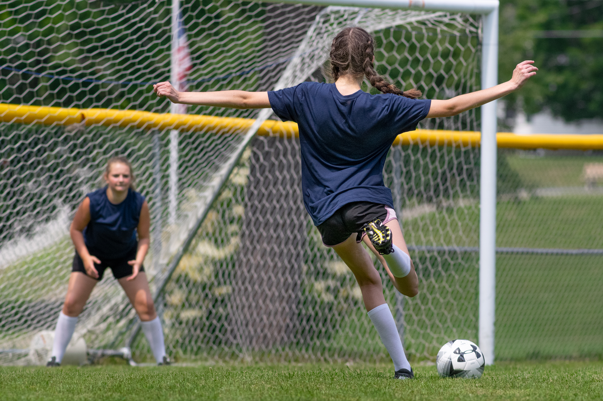
On a very hot summer day I shot a series of images of young people playing soccer for a company that makes outdoor products (e.g., sun screen). In this shot we all loved the graceful “moment” as this young lady set up for a shot on goal, but the goalie just didn’t look very dynamic. Ah, but there was another frame… (In addition to the improvement in the action, you’ll also see lots of post-processing tweaking in the “after” shot.)
Swapping out backgrounds
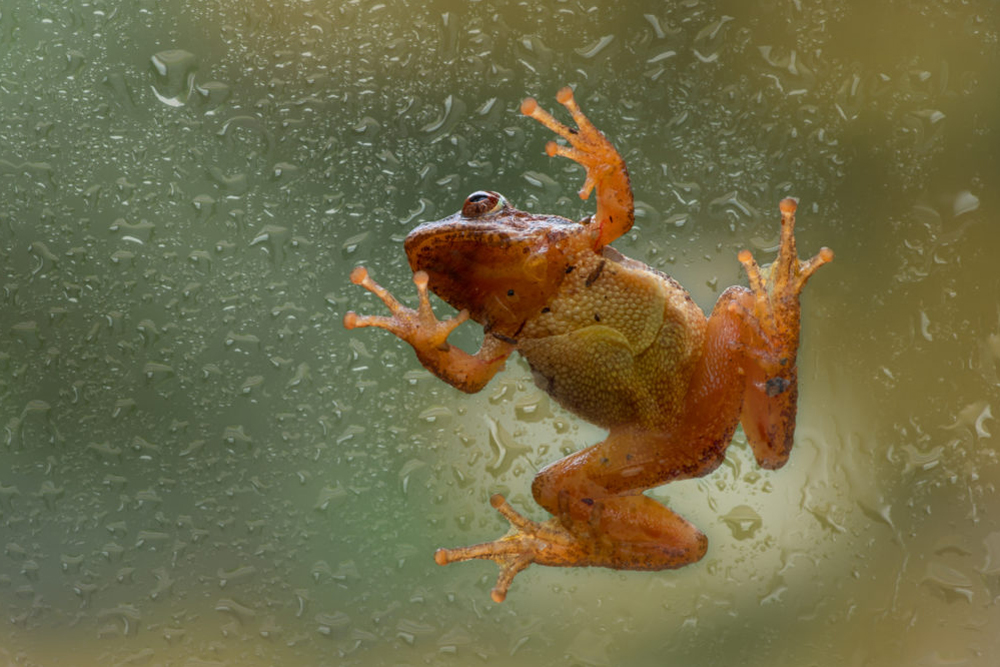
A coworker came up to my office one day and said, “Dude, you gotta come check out this frog on the window.” And there he was, halfway up a big sliding door, just sitting there (or standing, I’m not sure what to call it). He never moved during the 20 minutes or so that I was shooting photos, and although the original shot through the clear glass was fascinating, I wondered what he would have looked like on a rainy day.
Exposure correction
This is one of the 12 original frames that make up this composite image. Each of the frames needed significant editing, especially for the shadow and highlight exposures. But I had planned to stack (blend) the images from the outset, and so was not surprised by the muddy, darkish RAW files (RAW is a file format that provides the most image data; and I purposely exposed for the highlights; it’s always easier to recover shadow detail). The finished composite is one of my favorites from 2018.
Color balance & selective blur
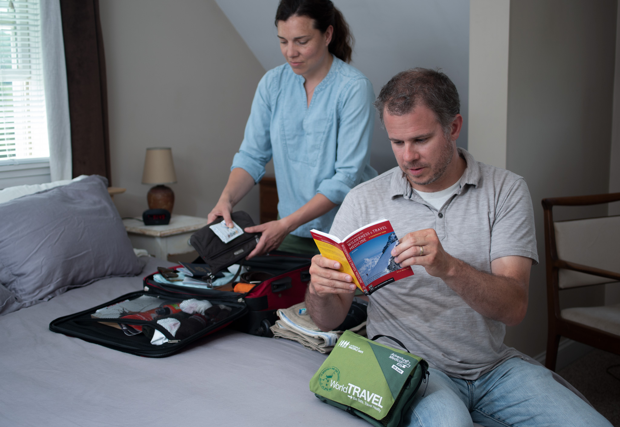
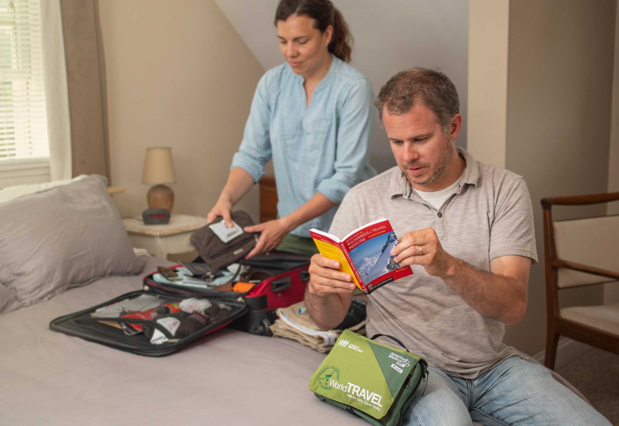
Although we spent a half hour or so working out the lighting on this shot to make sure it was even, the resulting RAW file clearly needed work. It was way too cool, the shadows were too dark, the skin tones looked almost aquatic, and the model in the background was a little too sharp. All these things were easily manipulated during post processing, and the result is a warm, inviting, nicely exposed shot, that clearly puts the emphasis on the foreground model.
Logo removal
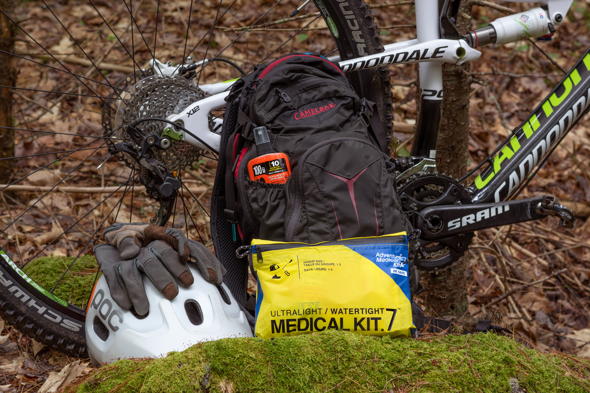
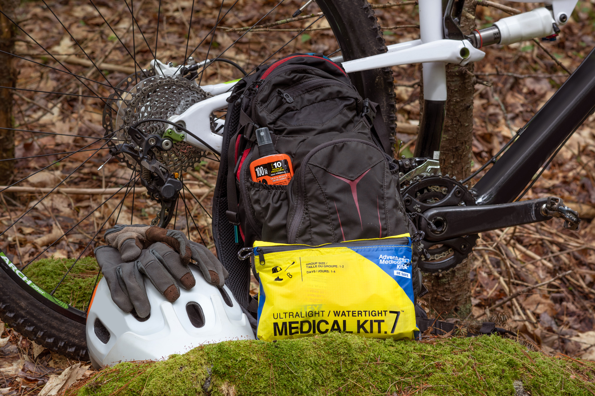
This is a classic challenge for product photography: your client wants to highlight their products in a setting using appropriate props, but they don’t want any identifying logos or other distractions on the props to show. In this photo, the client needed their med kit and insect repellent to be prominent, but they didn’t want any of the prop logos to be in the shot. The answer? About an hour of Photoshop time using a variety of cloning, filling, blurring, and noise techniques. To get this to look seamless and natural is a huge photo-editing task! (The one remaining logo at far lower left was cropped out prior to use.)
Major repair
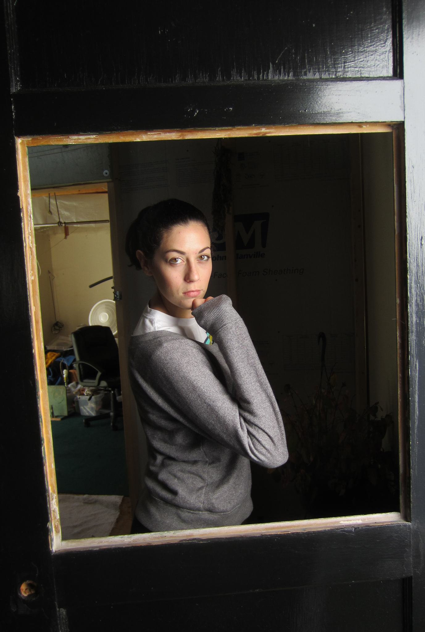
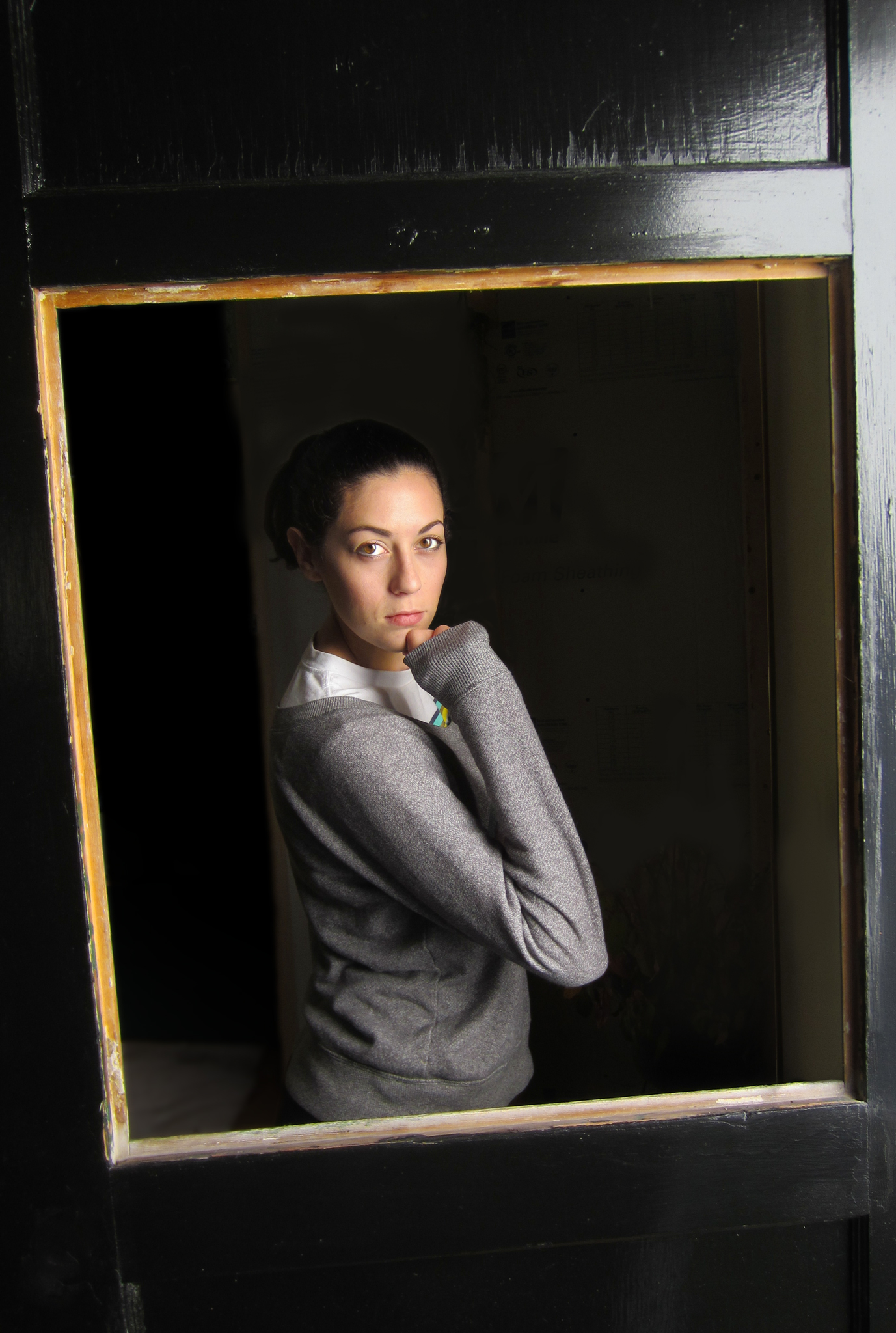
This spur-of-the-moment shot of my daughter, taken with a cheap point-and-shoot camera, obviously needed a lot of help. Had I set the shot up deliberately, I wouldn’t have had to work so hard, but she just walked by and struck this dramatic pose while I was repairing a window. While it’s no portfolio shot, it nonetheless shows the kind of transformation that good post processing can bring about.
Content repair and special effects
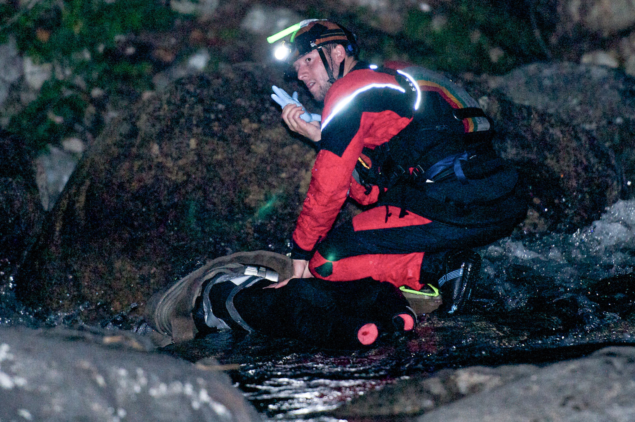
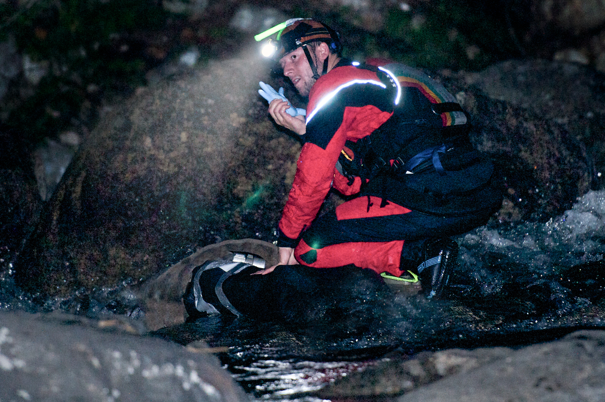
This was shot was taken by a local photographer during a fast-water rescue training session. I wanted to use it to depict the general idea of “rescue” in a book I designed for my company. The image was intense, but there were two distracting elements: you could tell that the “victim” was fake because the rolls of foam padding were visible in the background, and the two red glowing orbs in the foreground were just plain weird. Careful cloning took care of both problems, and then I added the headlight beam, darkened the background and edges, and added noise to make it more gritty. (You might ask why the rescuer is speaking into a rubber glove…well, inside the rubber glove is a radio, now made fully waterproof. Clever right?)
Adding emphasis
One of the simplest ways to add emphasis to the subject of an image is to blur the background. While this can often be done effectively in-camera, sometimes (okay, often) a client will ask for the background to be blurred even more. Fortunately, this can easily be accomplished using the magic of Photoshop—in this case very clearly emphasizing the main subject at an abandoned granite quarry, adding a bit of drama, and turning a snapshot into something so much better.
Masking
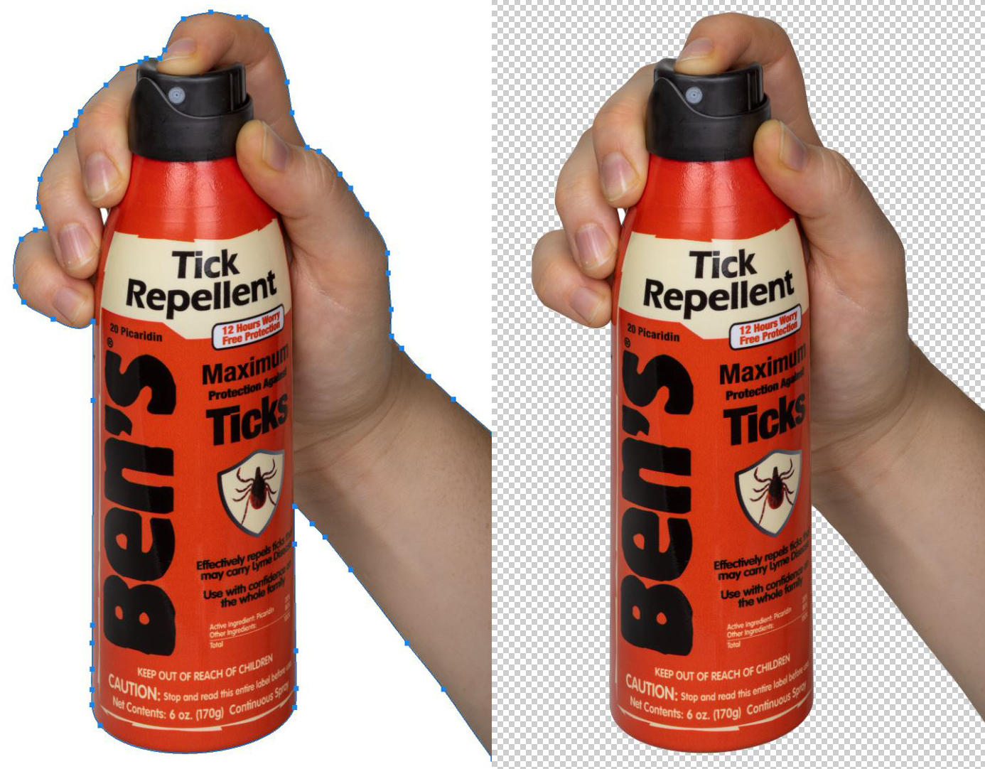
For many studio product shots, a vector mask is needed so that the client can drop the image on anything, such as a white or colored background. When combined with Photoshop’s powerful Smart Object technology, you can resize your image to fit your needs without losing quality. If you need vector masks, I can make them, priced on an image-by-image basis, depending on complexity. (Left: product being cut out of background, right: product isolated and ready to be dropped anywhere.)
Have a seat and let's talk.
S. Peter Lewis
368 Sweden Rd. Bridgton, ME 04009
speterlewis@gmail.com | 207-239-4154

© 2020 S. Peter Lewis | All rights reserved | My hearty thanks to SOLO Schools and Tender Corporation for graciously allowing me to use some of the work I have done for them on this site.


